
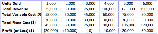
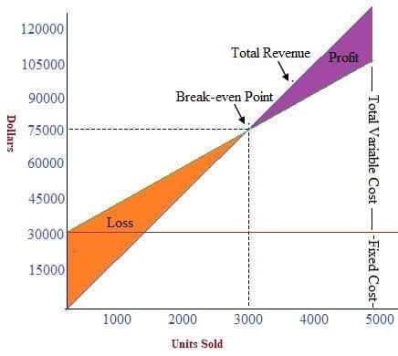
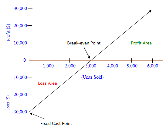
Cost-volume-profit (CVP) relationships, or break-even relationships, can be visualized using graphs. Doing so comes with the advantage of showing CVP relationships over a range of sales. Graphical analysis also enables managers to identify areas of profit or loss that would occur for a broad range of sales activities. To give an example, consider how the data in the table below have been used to create the break-even chart. In plotting the graph, it is assumed that the selling price remains at $25, the variable cost remains at $15 per unit, and the fixed cost remains at $30,000 over the range of units sold. The units sold are plotted on the horizontal axis, while total revenue is shown on the vertical axis. The total revenue line is plotted, running from $0 at zero sales volume to $150,000 at a sales volume of 6,000 units at $25 per unit. The total cost line is the sum total of fixed cost ($3,000) and variable cost of $15 per unit, plotted for various quantities of units to be sold. The intersection of the two lines indicates the break-even point. Below and to the left of the break-even point, the difference between the total cost line and the total revenue line reflects the net loss for the period. Conversely, the distance between these two lines to the right of the break-even point represents the net profit for the period. The break-even graph clearly shows the relationship between profit and volume by indicating the net profit or loss associated with any given volume of units sold. However, the graph can be interpreted only within the relevant range of operations (i.e., the level of activity over which fixed costs are assumed to remain fixed). A simpler version of the break-even chart is known as the profit-volume graph (P/V graph). This graph shows a direct relationship between sales and profits, and it is easy to understand. Break-even charts and P/V graphs are often used together to benefit from the advantages of both visualizations. The vertical axis shows total profits or losses, while the horizontal axis represents units of product and sales revenue. An advantage of the P/V graph is that profit and losses at any point can be read directly from the vertical axis. The data used to prepare the break-even chart, as shown above, have also been used to prepare the P/V graph shown below. The intersection of the profit line with the horizontal line gives the break-even point. Points above the line measure profits while points below the line measure losses. The P/V graph is a simple and convenient way to show the extent to which profits are affected by changes in the factors that affect profit. For example, if unit selling prices, unit variable costs, and total fixed costs remain constant, the P/V graph can show how many units must be sold to achieve a target profit. Additionally, if the variable cost per unit can be reduced, the P/V graph shows the additional profits that can be expected at any given sales volume. An advantage of the P/ V graph is that profits and losses at any point in time can be read directly from the vertical scale. However, a major disadvantage is that the graph does not clearly reveal how costs vary with changes in activity. For these reasons, and as mentioned earlier, both the P/V graph and break-even chart are used alongside one another by financial managers.Break-even Chart
Profit-volume Graph (P/V Graph)
Graphical Representation of Break-even Analysis FAQs
CVP is a budgeting process that can be used to establish the break-even point and the expected operating income of the business.
The simplest form of the break-even chart, wherein total profits are plotted on the vertical axis while units sold are plotted on the horizontal axis.
Graphical representation of break-even analysis is useful as it can show the relationship between profits and volume by indicating the net profit or loss associated with any given volume of units sold.
The break-even chart is restricted to its relevant range of operations (i.E., Level of activity over which the variable costs are assumed to remain constant) while the p/v graph does not clearly reveal how costs vary with changes inactivity.
Break-even analysis is a tool that can be used to demonstrate and calculate how much revenue is needed to make a certain amount of profit, assuming expenses remain constant.
True Tamplin is a published author, public speaker, CEO of UpDigital, and founder of Finance Strategists.
True is a Certified Educator in Personal Finance (CEPF®), author of The Handy Financial Ratios Guide, a member of the Society for Advancing Business Editing and Writing, contributes to his financial education site, Finance Strategists, and has spoken to various financial communities such as the CFA Institute, as well as university students like his Alma mater, Biola University, where he received a bachelor of science in business and data analytics.
To learn more about True, visit his personal website or view his author profiles on Amazon, Nasdaq and Forbes.


